library(tidyverse)

cars_summary <- mpg |>
  group_by(year, drv) |>
  summarize(
    n = n(),
    avg_mpg = mean(hwy),
    median_mpg = median(hwy),
    min_mpg = min(hwy),
    max_mpg = max(hwy)
  ) |>
ungroup()Making nicer and fancier tables
resources
Many of you have asked about how to make prettier tables with R and Quarto. There’s a whole world of packages for making beautiful tables with R! Four of the most common ones are {gt}, the brand new and invented-to-improve-on-{kableExtra} {tinytable}, {kableExtra}, and {flextable}:
| Package | Output support | Notes | |||
|---|---|---|---|---|---|
| HTML | Word | ||||
Great |
Okay |
Okay |
Has the goal of becoming the “grammar of tables” (hence “gt”). It is supported by developers at Posit and gets updated and improved regularly. It’ll likely become the main table-making package for R. |
||
Great |
Great |
Okay |
Made by the same developer as {modelsummary}, this brand new package essentially replaces the now-defunct {kableExtra} and is designed to work spectaularly well with PDF and HTML. |
||
Great |
Great |
Okay |
Works really well for HTML output and has the best support for PDF output, but development has stalled for the past couple years and it seems to maybe be abandoned, which is sad. |
||
Great |
Okay |
Great |
Works really well for HTML output and has the best support for Word output. It’s not abandoned and gets regular updates. |
||
General examples
Here’s a quick illustration of these packages. All four are incredibly powerful and let you do all sorts of really neat formatting things ({gt} even makes interactive HTML tables!), so make sure you check out the documentation and examples. I personally use all of them, depending on which output I’m working with. When rendering to HTML, I use {gt} or {tinytable}; when rendering to PDF I use {tinytable} or {gt}; when knitting to Word I use {flextable}.
library(gt)

cars_summary |>
  group_by(year) |>
  gt() |>
  cols_label(
    drv = "Drive",
    n = "N",
    avg_mpg = "Average",
    median_mpg = "Median",
    min_mpg = "Minimum",
    max_mpg = "Maximum"
  ) |>
  tab_spanner(
    label = "Highway MPG",
    columns = c(avg_mpg, median_mpg, min_mpg, max_mpg)
  ) |>
  fmt_number(
    columns = avg_mpg,
    decimals = 2
  ) |>
  tab_options(
    row_group.as_column = TRUE
)| Drive | N | Highway MPG | ||||
|---|---|---|---|---|---|---|
| Average | Median | Minimum | Maximum | |||
| 1999 | 4 | 49 | 18.84 | 17 | 15 | 26 |
| f | 57 | 27.91 | 26 | 21 | 44 | |
| r | 11 | 20.64 | 21 | 16 | 26 | |
| 2008 | 4 | 54 | 19.48 | 19 | 12 | 28 |
| f | 49 | 28.45 | 29 | 17 | 37 | |
| r | 14 | 21.29 | 21 | 15 | 26 | |
library(tinytable)

cars_summary |>
  select(-year) |>
  rename(
    "Drive" = drv,
    "N" = n,
    "Average" = avg_mpg,
    "Median" = median_mpg,
    "Minimum" = min_mpg,
    "Maximum" = max_mpg
  ) |>
  tt() |>
  group_tt(
    i = list("1999" = 1, "2008" = 4),
    j = list("Highway MPG" = 3:6)
  ) |>
  style_tt(
    i = c(1, 5),
    bold = TRUE,
    line = "b",
    line_color = "#cccccc"
  ) |>
  style_tt(j = 2:6, align = "c") |>
format_tt(j = 3, digits = 2, num_fmt = "decimal")| Highway MPG | |||||
|---|---|---|---|---|---|
| Drive | N | Average | Median | Minimum | Maximum |
| 4 | 49 | 18.84 | 17 | 15 | 26 |
| f | 57 | 27.91 | 26 | 21 | 44 |
| r | 11 | 20.64 | 21 | 16 | 26 |
| 4 | 54 | 19.48 | 19 | 12 | 28 |
| f | 49 | 28.45 | 29 | 17 | 37 |
| r | 14 | 21.29 | 21 | 15 | 26 |
library(kableExtra)

cars_summary |>
  select(-year) |>
  kbl(
    col.names = c("Drive", "N", "Average", "Median", "Minimum", "Maximum"),
    digits = 2
  ) |>
  kable_styling() |>
  pack_rows("1999", 1, 3) |>
  pack_rows("2008", 4, 6) |>
add_header_above(c(" " = 2, "Highway MPG" = 4))| Drive | N | Average | Median | Minimum | Maximum |
|---|---|---|---|---|---|
| 1999 | |||||
| 4 | 49 | 18.84 | 17 | 15 | 26 |
| f | 57 | 27.91 | 26 | 21 | 44 |
| r | 11 | 20.64 | 21 | 16 | 26 |
| 2008 | |||||
| 4 | 54 | 19.48 | 19 | 12 | 28 |
| f | 49 | 28.45 | 29 | 17 | 37 |
| r | 14 | 21.29 | 21 | 15 | 26 |
library(flextable)

cars_summary |>
  rename(
    "Year" = year,
    "Drive" = drv,
    "N" = n,
    "Average" = avg_mpg,
    "Median" = median_mpg,
    "Minimum" = min_mpg,
    "Maximum" = max_mpg
    ) |>
  mutate(Year = as.character(Year)) |>
  flextable() |>
  colformat_double(j = "Average", digits = 2) |>
  add_header_row(values = c(" ", "Highway MPG"), colwidths = c(3, 4)) |>
  align(i = 1, part = "header", align = "center") |>
  merge_v(j = ~ Year) |>
  valign(j = 1, valign = "top")
| Highway MPG | |||||
|---|---|---|---|---|---|---|
Year | Drive | N | Average | Median | Minimum | Maximum |
1999 | 4 | 49 | 18.84 | 17 | 15 | 26 |
f | 57 | 27.91 | 26 | 21 | 44 | |
r | 11 | 20.64 | 21 | 16 | 26 | |
2008 | 4 | 54 | 19.48 | 19 | 12 | 28 |
f | 49 | 28.45 | 29 | 17 | 37 | |
r | 14 | 21.29 | 21 | 15 | 26 | |
Fancier {modelsummary}
{modelsummary} works with all of these table-making packages, and you can control which one is used with the output argument. As of {modelsummary} v2.0, the default table-making backend is {tinytable} (it used to be {kableExtra}, but again, that’s relatively abandoned nowadays).
You can see examples of how to use each of these table-making packages to customize {modelsummary} output at the documentation.
Here’s one quick example using {tinytable} for customization:
library(modelsummary)

model1 <- lm(hwy ~ displ, data = mpg)
model2 <- lm(hwy ~ displ + drv, data = mpg)

modelsummary(
  list(model1, model2),
  stars = TRUE,
  # Rename the coefficients
  coef_rename = c(
    "(Intercept)" = "Intercept",
    "displ" = "Displacement",
    "drvf" = "Drive (front)",
    "drvr" = "Drive (rear)"),
  # Get rid of some of the extra goodness-of-fit statistics
  gof_omit = "IC|RMSE|F|Log",
  # Use {tinytable} (this is optional since it's the default)
  output = "tinytable"
) |>
  style_tt(i = 3:4, j = 2, background = "yellow") |>
style_tt(i = 3:4, j = 3, background = "black", color = "white")| (1) | (2) | |
|---|---|---|
| + p < 0.1, * p < 0.05, ** p < 0.01, *** p < 0.001 | ||
| Intercept | 35.698*** | 30.825*** |
| (0.720) | (0.924) | |
| Displacement | -3.531*** | -2.914*** |
| (0.195) | (0.218) | |
| Drive (front) | 4.791*** | |
| (0.530) | ||
| Drive (rear) | 5.258*** | |
| (0.734) | ||
| Num.Obs. | 234 | 234 |
| R2 | 0.587 | 0.736 |
| R2 Adj. | 0.585 | 0.732 |
Table captions and numbering
One really nice Quarto feature is the ability to automatically generate cross references to figures and tables. To do this, you’ll need to do three things:
- Add a chunk label using the
labeloption in the chunk options. For tables, you need to use atbl-prefix; for figures you need to use afig-prefix. - Add a caption using either the
tbl-caporfig-capoption in the chunk options. - Reference the table or figure in your text by typing
@tbl-whatever-your-label-isor@fig-whatever-your-label-is
Here’s how it all works—type this…
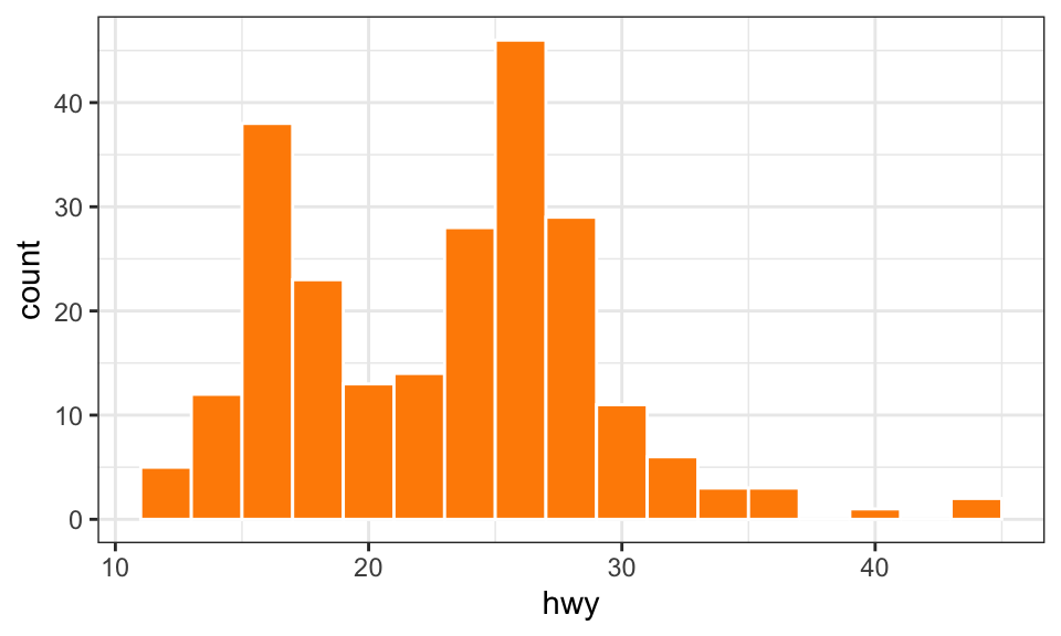
Blah blah blah I'm typing about causal inference; see @fig-example.

```{r}
#| label: fig-example
#| fig-cap: "This is a histogram"
#| fig-width: 5
#| fig-height: 3

ggplot(mpg, aes(x = hwy)) +
  geom_histogram(binwidth = 2, color = "white", fill = "darkorange") +
  theme_bw()
```

And more blah stuff here, and @tbl-other-example has some results in it.

```{r}
#| label: tbl-other-example
#| tbl-cap: "A table with stuff in it"

mpg |>
  select(year, cyl, trans, drv) |>
  slice(1:4) |>
  tt()
```
… to get this:
Blah blah blah I’m typing about causal inference; see Figure 1.
And more blah stuff here, and Table 1 has some results in it.
| year | cyl | trans | drv |
|---|---|---|---|
| 1999 | 4 | auto(l5) | f |
| 1999 | 4 | manual(m5) | f |
| 2008 | 4 | manual(m6) | f |
| 2008 | 4 | auto(av) | f |