class: center middle main-title section-title-1 # Visualize data<br>with ggplot2 .class-info[ <figure> <img src="img/01-class/03/ggplot-logo.png" alt="ggplot" title="ggplot" width="15%"> </figure> ] --- class: title title-1 # Cars and displacement .box-inv-1.medium[What is the relationship between a car's<br>engine weight (displacement) and its mileage (miles per gallon)?] --- class: title title-1 section-title-inv-1 # Your turn #1 .box-1[Run this code in your Quarto file to make a graph] .box-1[Pay attention to spelling, capitalization, and parentheses!] ```r ggplot(data = mpg) + geom_point(mapping = aes(x = displ, y = hwy)) ``` <div class="countdown" id="timer_ef6c0526" data-update-every="1" data-play-sound="true" tabindex="0" style="right:0;bottom:0;font-size:1.5em;"> <div class="countdown-controls"><button class="countdown-bump-down">−</button><button class="countdown-bump-up">+</button></div> <code class="countdown-time"><span class="countdown-digits minutes">02</span><span class="countdown-digits colon">:</span><span class="countdown-digits seconds">00</span></code> </div> --- ```r ggplot(data = mpg) + geom_point(mapping = aes(x = displ, y = hwy)) ``` <img src="01-class_04_visualize-data_files/figure-html/unnamed-chunk-3-1.png" width="60%" style="display: block; margin: auto;" /> --- class: bg-full bg-y-75 background-image: url("img/01-class/03/napoleon-retreat.jpg") ??? Source: [Wikipedia](https://en.wikipedia.org/wiki/File:National_Museum_in_Poznan_-_Przej%C5%9Bcie_przez_Berezyn%C4%99.JPG) --- layout: true class: title title-1 --- # Long distance! .center[ <figure> <img src="img/01-class/03/napoleon-google-maps.png" alt="Moscow to Vilnius" title="Moscow to Vilnius" width="80%"> <figcaption>Moscow to Vilnius</figcaption> </figure> ] --- # Very cold! <img src="01-class_04_visualize-data_files/figure-html/minard-temps-1.png" width="864" style="display: block; margin: auto;" /> --- # Lots of people died! <img src="01-class_04_visualize-data_files/figure-html/minard-deaths-1.png" width="468" style="display: block; margin: auto;" /> --- layout: false class: bg-full background-image: url("img/01-class/03/minard.png") ??? Source: [Wikimedia Commons](https://upload.wikimedia.org/wikipedia/commons/2/29/Minard.png) --- layout: true class: title title-1 --- # Mapping data to aesthetics .pull-left.center[ <figure> <img src="img/01-class/03/gg-book.jpg" alt="Grammar of Graphics book" title="Grammar of Graphics book" width="55%"> </figure> ] .pull-right[ .box-inv-1.medium[Aesthetic] .box-1[Visual property of a graph] .box-1.sp-after[Position, shape, color, etc.] .box-inv-1.medium[Data] .box-1[A column in a dataset] ] --- # Mapping data to aesthetics <table> <tr> <th class="cell-left">Data</th> <th class="cell-left">Aesthetic</th> <th class="cell-left">Graphic/Geometry</th> </tr> <tr> <td class="cell-left">Longitude</td> <td class="cell-left">Position (x-axis) </td> <td class="cell-left">Point</td> </tr> <tr> <td class="cell-left">Latitude</td> <td class="cell-left">Position (y-axis)</td> <td class="cell-left">Point</td> </tr> <tr> <td class="cell-left">Army size</td> <td class="cell-left">Size</td> <td class="cell-left">Path</td> </tr> <tr> <td class="cell-left">Army direction </td> <td class="cell-left">Color</td> <td class="cell-left">Path</td> </tr> <tr> <td class="cell-left">Date</td> <td class="cell-left">Position (x-axis)</td> <td class="cell-left">Line + text</td> </tr> <tr> <td class="cell-left">Temperature</td> <td class="cell-left">Position (y-axis)</td> <td class="cell-left">Line + text</td> </tr> </table> --- # Mapping data to aesthetics <table> <tr> <th class="cell-left">Data</th> <th class="cell-left"><code class="remark-inline-code">aes()</code></th> <th class="cell-left"><code class="remark-inline-code">geom</code></th> </tr> <tr> <td class="cell-left">Longitude</td> <td class="cell-left"><code class="remark-inline-code">x</code></td> <td class="cell-left"><code class="remark-inline-code">geom_point()</code></td> </tr> <tr> <td class="cell-left">Latitude</td> <td class="cell-left"><code class="remark-inline-code">y</code></td> <td class="cell-left"><code class="remark-inline-code">geom_point()</code></td> </tr> <tr> <td class="cell-left">Army size</td> <td class="cell-left"><code class="remark-inline-code">size</code></td> <td class="cell-left"><code class="remark-inline-code">geom_path()</code></td> </tr> <tr> <td class="cell-left">Army direction </td> <td class="cell-left"><code class="remark-inline-code">color</code> </td> <td class="cell-left"><code class="remark-inline-code">geom_path()</code></td> </tr> <tr> <td class="cell-left">Date</td> <td class="cell-left"><code class="remark-inline-code">x</code></td> <td class="cell-left"><code class="remark-inline-code">geom_line() + geom_text()</code></td> </tr> <tr> <td class="cell-left">Temperature</td> <td class="cell-left"><code class="remark-inline-code">y</code></td> <td class="cell-left"><code class="remark-inline-code">geom_line() + geom_text()</code></td> </tr> </table> --- # `ggplot()` template <code class ='r hljs remark-code'>ggplot(data = <b><span style="background-color:#CBB5FF">DATA</span></b>) +<br> <b><span style="background-color:#FFDFD1">GEOM_FUNCTION</span></b>(mapping = aes(<b><span style="background-color:#FFD0CF">AESTHETIC MAPPINGS</span></b>))</code> -- <code class ='r hljs remark-code'>ggplot(data = <b><span style="background-color:#CBB5FF">troops</span></b>) +<br> <b><span style="background-color:#FFDFD1">geom_path</span></b>(mapping = aes(<b><span style="background-color:#FFD0CF">x = longitude</span></b>,<br> <b><span style="background-color:#FFD0CF">y = latitude</span></b>,<br> <b><span style="background-color:#FFD0CF">color = direction</span></b>,<br> <b><span style="background-color:#FFD0CF">size = survivors</span></b>))</code> --- layout: false .box-1[This is a dataset named `troops`:] .small[ <table> <thead> <tr> <th style="text-align:left;"> longitude </th> <th style="text-align:left;"> latitude </th> <th style="text-align:left;"> direction </th> <th style="text-align:left;"> survivors </th> </tr> </thead> <tbody> <tr> <td style="text-align:left;"> 24 </td> <td style="text-align:left;"> 54.9 </td> <td style="text-align:left;"> A </td> <td style="text-align:left;"> 340000 </td> </tr> <tr> <td style="text-align:left;"> 24.5 </td> <td style="text-align:left;"> 55 </td> <td style="text-align:left;"> A </td> <td style="text-align:left;"> 340000 </td> </tr> <tr> <td style="text-align:left;"> … </td> <td style="text-align:left;"> … </td> <td style="text-align:left;"> … </td> <td style="text-align:left;"> … </td> </tr> </tbody> </table> ] -- <code class ='r hljs remark-code'>ggplot(data = <b><span style="background-color:#CBB5FF">troops</span></b>) +<br> <b><span style="background-color:#FFDFD1">geom_path</span></b>(mapping = aes(<b><span style="background-color:#FFD0CF">x = longitude</span></b>,<br> <b><span style="background-color:#FFD0CF">y = latitude</span></b>,<br> <b><span style="background-color:#FFD0CF">color = direction</span></b>,<br> <b><span style="background-color:#FFD0CF">size = survivors</span></b>))</code> --- <img src="01-class_04_visualize-data_files/figure-html/show-basic-minard-1.png" width="100%" style="display: block; margin: auto;" /> --- ```r ggplot(data = mpg) + geom_point(mapping = aes(x = displ, y = hwy)) ``` <img src="01-class_04_visualize-data_files/figure-html/unnamed-chunk-4-1.png" width="60%" style="display: block; margin: auto;" /> --- layout: true class: title title-1 --- # Heavy cars with better mileage? <img src="01-class_04_visualize-data_files/figure-html/unnamed-chunk-5-1.png" width="60%" style="display: block; margin: auto;" /> --- # Aesthetics .pull-left-3[ .box-inv-1.small[`color` (discrete)] <img src="01-class_04_visualize-data_files/figure-html/aes-color-discrete-1.png" width="100%" style="display: block; margin: auto;" /> .box-inv-1.small[`color` (continuous)] <img src="01-class_04_visualize-data_files/figure-html/aes-color-continuous-1.png" width="100%" style="display: block; margin: auto;" /> ] .pull-middle-3[ .box-inv-1.small[`size`] <img src="01-class_04_visualize-data_files/figure-html/aes-size-1.png" width="100%" style="display: block; margin: auto;" /> .box-inv-1.small[`fill`] <img src="01-class_04_visualize-data_files/figure-html/aes-fill-1.png" width="100%" style="display: block; margin: auto;" /> ] .pull-right-3[ .box-inv-1.small[`shape`] <img src="01-class_04_visualize-data_files/figure-html/aes-shape-1.png" width="100%" style="display: block; margin: auto;" /> .box-inv-1.small[`alpha`] <img src="01-class_04_visualize-data_files/figure-html/aes-alpha-1.png" width="100%" style="display: block; margin: auto;" /> ] --- # Mapping columns to aesthetics .small[ ```r ggplot(mpg) + geom_point(aes(x = displ, y = hwy, color = class)) ggplot(mpg) + geom_point(aes(x = displ, y = hwy, size = class)) ggplot(mpg) + geom_point(aes(x = displ, y = hwy, shape = class)) ggplot(mpg) + geom_point(aes(x = displ, y = hwy, alpha = class)) ``` ] --- layout: false ```r ggplot(data = mpg) + geom_point(mapping = aes(x = displ, y = hwy, color = class)) ``` <img src="01-class_04_visualize-data_files/figure-html/unnamed-chunk-7-1.png" width="60%" style="display: block; margin: auto;" /> --- class: title title-1 section-title-inv-1 # Your turn #2 .box-1[Add color, size, alpha, and shape aesthetics to your graph.] .box-1[Experiment!] .box-1[Do different things happen when you map aesthetics to discrete and continuous variables?] .box-1[What happens when you use more than one aesthetic?] --- class: title title-1 # How would you make this plot? <img src="01-class_04_visualize-data_files/figure-html/unnamed-chunk-8-1.png" width="70%" style="display: block; margin: auto;" /> --- .left-code[ ```r ggplot(mpg) + geom_point(aes(x = displ, y = hwy, color = class)) ``` ] .right-plot[ 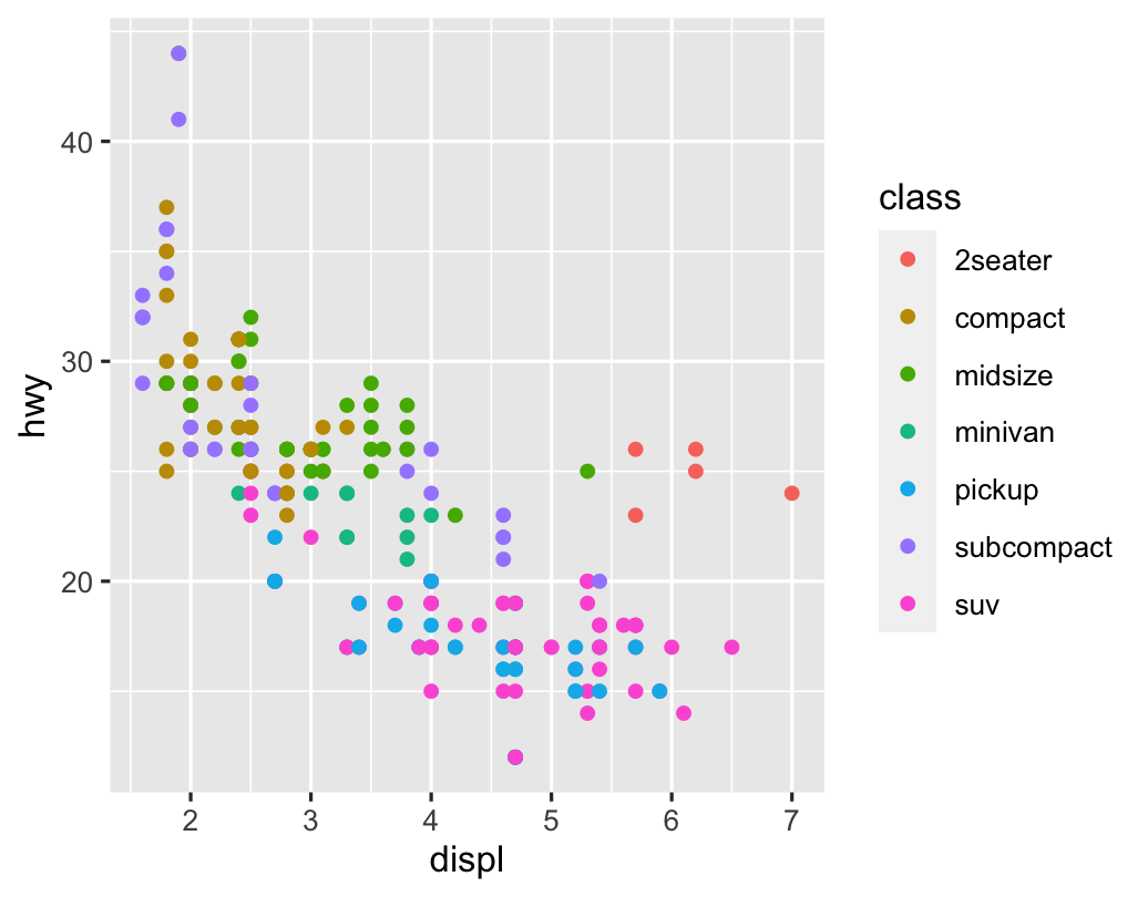 ] --- .left-code[ ```r ggplot(mpg) + geom_point(aes(x = displ, y = hwy), color = "blue") ``` ] .right-plot[  ] --- .pull-left[ .small[ ```r ggplot(mpg) + geom_point(aes(x = displ, y = hwy, color = "blue")) ``` <img src="01-class_04_visualize-data_files/figure-html/unnamed-chunk-9-1.png" width="100%" style="display: block; margin: auto;" /> ] ] .pull-right[ .small[ ```r ggplot(mpg) + geom_point(aes(x = displ, y = hwy), color = "blue") ``` <img src="01-class_04_visualize-data_files/figure-html/unnamed-chunk-10-1.png" width="100%" style="display: block; margin: auto;" /> ] ] --- layout: true class: title title-1 --- # What's the same? What's different? .pull-left[ <img src="01-class_04_visualize-data_files/figure-html/unnamed-chunk-11-1.png" width="100%" style="display: block; margin: auto;" /> ] .pull-right[ <img src="01-class_04_visualize-data_files/figure-html/unnamed-chunk-12-1.png" width="100%" style="display: block; margin: auto;" /> ] --- # Geoms <code class ='r hljs remark-code'>ggplot(data = <b><span style="background-color:#CBB5FF">DATA</span></b>) +<br> <b><span style="background-color:#FFDFD1">GEOM_FUNCTION</span></b>(mapping = aes(<b><span style="background-color:#FFD0CF">AESTHETIC MAPPINGS</span></b>))</code> --- # Possible geoms <table> <tr> <th class="cell-left"></th> <th class="cell-left">Example geom</th> <th class="cell-left">What it makes</th> </tr> <tr> <td class="cell-left"><img src="img/01-class/03/geom_bar.png"></td> <td class="cell-left"><code class="remark-inline-code">geom_col()</code></td> <td class="cell-left">Bar charts</td> </tr> <tr> <td class="cell-left"><img src="img/01-class/03/geom_text.png"></td> <td class="cell-left"><code class="remark-inline-code">geom_text()</code></td> <td class="cell-left">Text</td> </tr> <tr> <td class="cell-left"><img src="img/01-class/03/geom_point.png"></td> <td class="cell-left"><code class="remark-inline-code">geom_point()</code></td> <td class="cell-left">Points</td> </tr> <tr> <td class="cell-left"><img src="img/01-class/03/geom_boxplot.png"></td> <td class="cell-left"><code class="remark-inline-code">geom_boxplot()</code> </td> <td class="cell-left">Boxplots</td> </tr> <tr> <td class="cell-left"><img src="img/01-class/03/geom_sf.png"></td> <td class="cell-left"><code class="remark-inline-code">geom_sf()</code></td> <td class="cell-left">Maps</td> </tr> </table> --- # Possible geoms .box-inv-1[There are dozens of possible geoms!] .box-1[See [the **ggplot2** documentation](https://ggplot2.tidyverse.org/reference/index.html#section-layer-geoms) for<br>complete examples of all the different geom layers] .box-1[Also see the ggplot cheatsheet] --- layout: false class: title title-1 section-title-inv-1 # Your turn #3 .box-1[Replace this scatterplot with boxplots. Use the cheatsheet.] .pull-left[ <img src="01-class_04_visualize-data_files/figure-html/unnamed-chunk-13-1.png" width="100%" style="display: block; margin: auto;" /> ] .pull-right[ <img src="01-class_04_visualize-data_files/figure-html/unnamed-chunk-14-1.png" width="100%" style="display: block; margin: auto;" /> ] <div class="countdown" id="timer_27ef6e71" data-update-every="1" tabindex="0" style="right:0;bottom:0;"> <div class="countdown-controls"><button class="countdown-bump-down">−</button><button class="countdown-bump-up">+</button></div> <code class="countdown-time"><span class="countdown-digits minutes">03</span><span class="countdown-digits colon">:</span><span class="countdown-digits seconds">00</span></code> </div> --- class: title title-1 section-title-inv-1 # Your turn #4 .box-1[Make a histogram of `hwy`. Use the cheetsheet.<br>Hint: don't supply a `y` variable.] <img src="01-class_04_visualize-data_files/figure-html/unnamed-chunk-16-1.png" width="70%" style="display: block; margin: auto;" /> --- class: title title-1 section-title-inv-1 # Your turn #5 .box-1[Make this density plot of `hwy` colored by `class`.<br>Use the cheatsheet. Hint: don't supply a `y` variable.] <img src="01-class_04_visualize-data_files/figure-html/unnamed-chunk-17-1.png" width="70%" style="display: block; margin: auto;" /> --- class: title title-1 # Complex graphs! <img src="01-class_04_visualize-data_files/figure-html/unnamed-chunk-18-1.png" width="70%" style="display: block; margin: auto;" /> --- class: title title-1 section-title-inv-1 # Your turn #6 .box-1[Predict what this code will do. Then run it.] ```r ggplot(data = mpg) + geom_point(mapping = aes(x = displ, y = hwy)) + geom_smooth(mapping = aes(x = displ, y = hwy)) ``` <div class="countdown" id="timer_88a90ec2" data-update-every="1" tabindex="0" style="right:0;bottom:0;"> <div class="countdown-controls"><button class="countdown-bump-down">−</button><button class="countdown-bump-up">+</button></div> <code class="countdown-time"><span class="countdown-digits minutes">02</span><span class="countdown-digits colon">:</span><span class="countdown-digits seconds">00</span></code> </div> --- class: title title-1 # Global vs. local .box-inv-1[Any aesthetics in `ggplot()` will show up in all `geom_` layers] .small[ ```r ggplot(data = mpg, mapping = aes(x = displ, y = hwy)) + geom_point() + geom_smooth() ``` <img src="01-class_04_visualize-data_files/figure-html/unnamed-chunk-21-1.png" width="60%" style="display: block; margin: auto;" /> ] --- class: title title-1 # Global vs. local .box-inv-1[Any aesthetics in `geom_` layers only apply to that layer] .small[ ```r ggplot(data = mpg, mapping = aes(x = displ, y = hwy)) + geom_point(mapping = aes(color = drv)) + geom_smooth() ``` <img src="01-class_04_visualize-data_files/figure-html/unnamed-chunk-22-1.png" width="60%" style="display: block; margin: auto;" /> ] --- layout: true class: title title-1 --- # So much more! .pull-left[ .box-inv-1[There are many other layers we can use to make and enhance graphs!] .box-inv-1[We sequentially add layers onto the foundational `ggplot()` plot to create complex figures] ] .pull-right[  ] --- # Putting it all together .box-inv-1.medium[We can build a plot sequentially<br>to see how each grammatical layer<br>changes the appearance] --- layout: false .left-code[ .box-1[Start with data and aesthetics] ```r *ggplot(data = mpg, * mapping = aes(x = displ, * y = hwy, * color = drv)) ``` ] .right-plot[  ] --- .left-code[ .box-1[Add a point geom] ```r ggplot(data = mpg, mapping = aes(x = displ, y = hwy, color = drv)) + * geom_point() ``` ] .right-plot[ 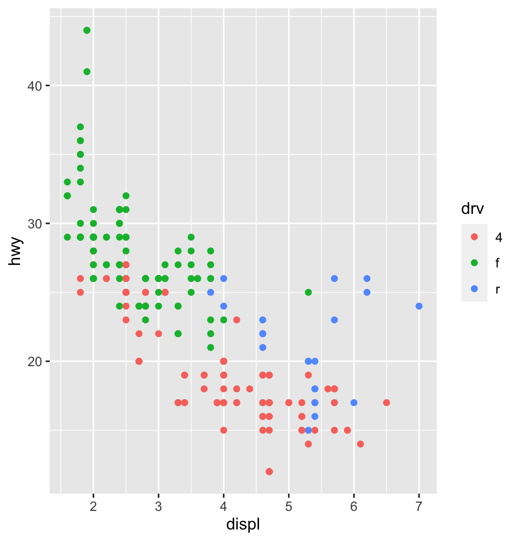 ] --- .left-code[ .box-1[Add a smooth geom] ```r ggplot(data = mpg, mapping = aes(x = displ, y = hwy, color = drv)) + geom_point() + * geom_smooth() ``` ] .right-plot[ 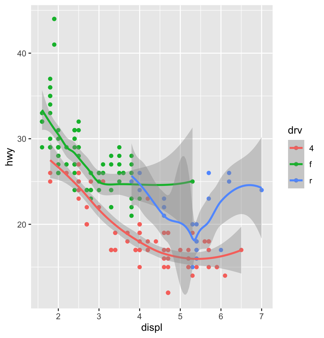 ] --- .left-code[ .box-1[Make it straight] ```r ggplot(data = mpg, mapping = aes(x = displ, y = hwy, color = drv)) + geom_point() + * geom_smooth(method = "lm") ``` ] .right-plot[ 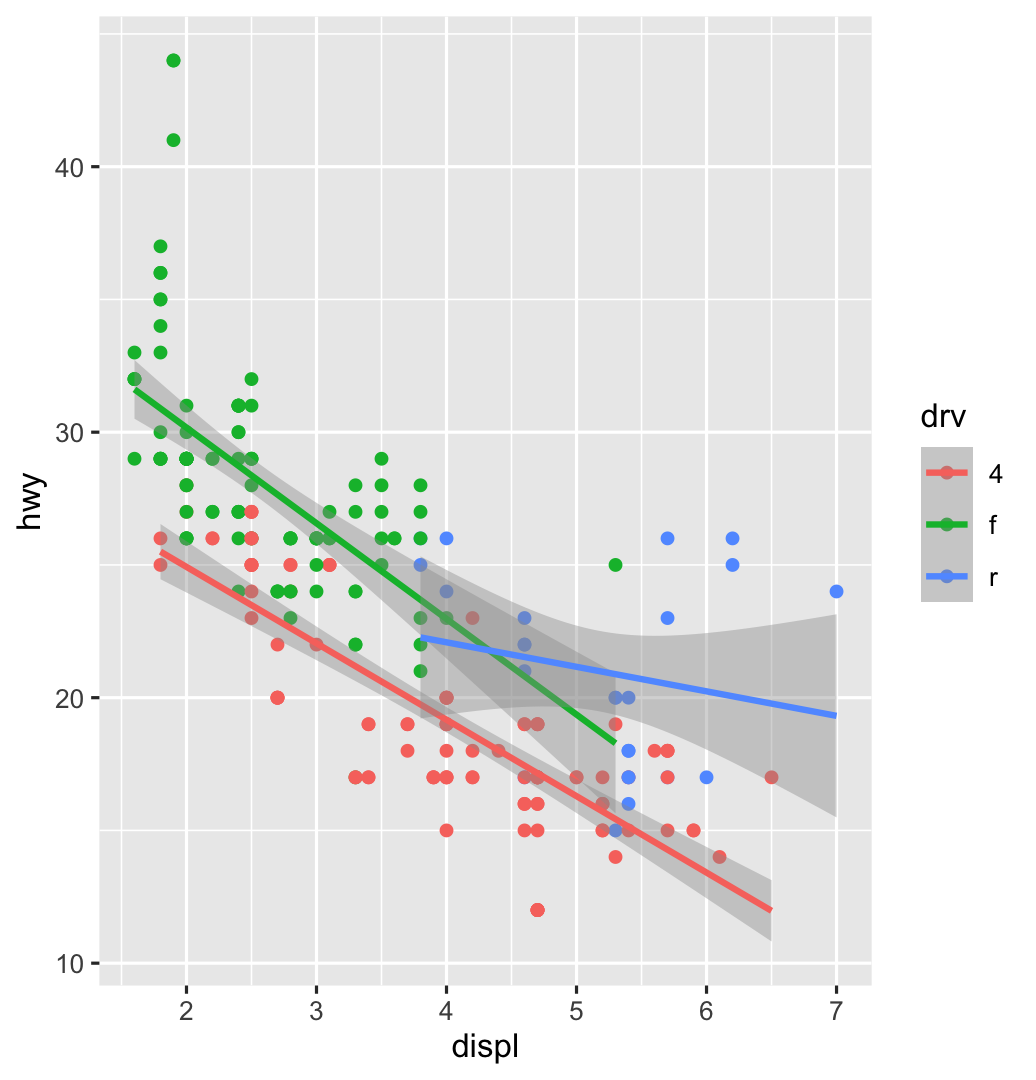 ] --- .left-code[ .box-1[Use a viridis color scale] ```r ggplot(data = mpg, mapping = aes(x = displ, y = hwy, color = drv)) + geom_point() + geom_smooth(method = "lm") + * scale_color_viridis_d() ``` ] .right-plot[ 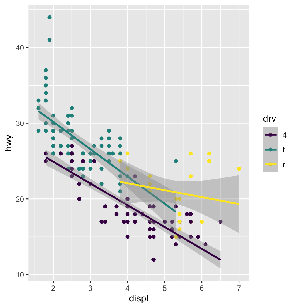 ] --- .left-code[ .box-1[Facet by drive] ```r ggplot(data = mpg, mapping = aes(x = displ, y = hwy, color = drv)) + geom_point() + geom_smooth(method = "lm") + scale_color_viridis_d() + * facet_wrap(vars(drv), ncol = 1) ``` ] .right-plot[ 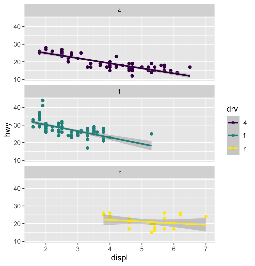 ] --- .left-code[ .box-1[Add labels] ```r ggplot(data = mpg, mapping = aes(x = displ, y = hwy, color = drv)) + geom_point() + geom_smooth(method = "lm") + scale_color_viridis_d() + facet_wrap(vars(drv), ncol = 1) + * labs(x = "Displacement", y = "Highway MPG", * color = "Drive", * title = "Heavier cars get lower mileage", * subtitle = "Displacement indicates weight(?)", * caption = "I know nothing about cars") ``` ] .right-plot[ 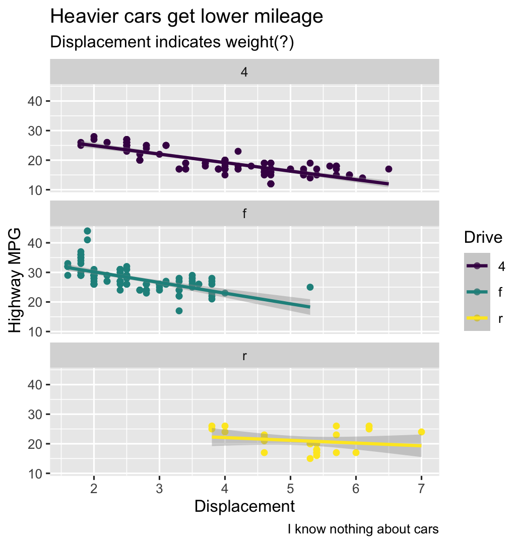 ] --- .left-code[ .box-1[Add a theme] ```r ggplot(data = mpg, mapping = aes(x = displ, y = hwy, color = drv)) + geom_point() + geom_smooth(method = "lm") + scale_color_viridis_d() + facet_wrap(vars(drv), ncol = 1) + labs(x = "Displacement", y = "Highway MPG", color = "Drive", title = "Heavier cars get lower mileage", subtitle = "Displacement indicates weight(?)", caption = "I know nothing about cars") + * theme_bw() ``` ] .right-plot[ 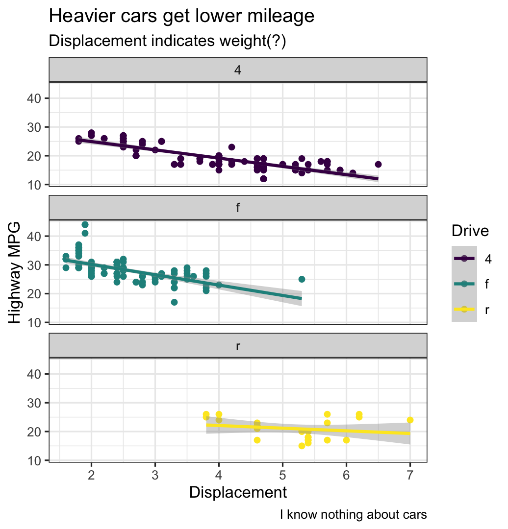 ] --- .left-code[ .box-1[Modify the theme] ```r ggplot(data = mpg, mapping = aes(x = displ, y = hwy, color = drv)) + geom_point() + geom_smooth(method = "lm") + scale_color_viridis_d() + facet_wrap(vars(drv), ncol = 1) + labs(x = "Displacement", y = "Highway MPG", color = "Drive", title = "Heavier cars get lower mileage", subtitle = "Displacement indicates weight(?)", caption = "I know nothing about cars") + theme_bw() + * theme(legend.position = "bottom", * plot.title = element_text(face = "bold")) ``` ] .right-plot[ 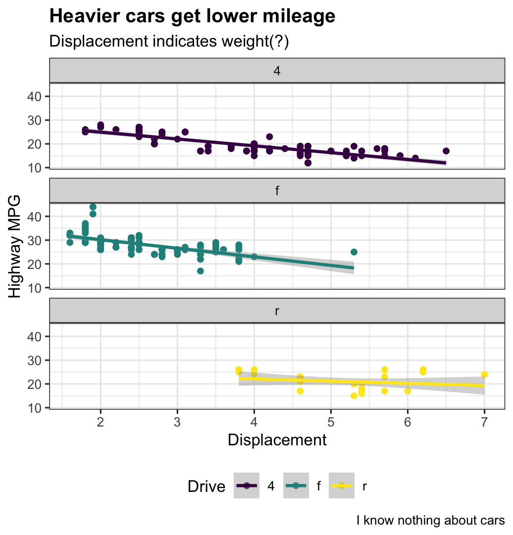 ] --- .left-code[ .box-1[Finished!] ```r ggplot(data = mpg, mapping = aes(x = displ, y = hwy, color = drv)) + geom_point() + geom_smooth(method = "lm") + scale_color_viridis_d() + facet_wrap(vars(drv), ncol = 1) + labs(x = "Displacement", y = "Highway MPG", color = "Drive", title = "Heavier cars get lower mileage", subtitle = "Displacement indicates weight(?)", caption = "I know nothing about cars") + theme_bw() + theme(legend.position = "bottom", plot.title = element_text(face = "bold")) ``` ] .right-plot[  ] --- class: title title-1 # Next up .box-inv-1.medium[Transforming and<br>manipulating data with dplyr]